


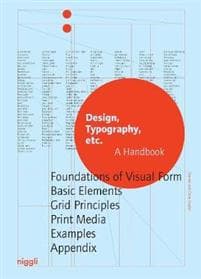

Why does a newspaper look different than a magazine or a book? What effect does using a certain typeface or a specific grid have? And why do some layouts just seem right, and others seem simply wrong? This comprehensive handbook and reference volume elaborates by means of sketches and explanations on the basics and terminology that are indispensable for the design and production of print media. From the initial layout and the correct use of color and typefaces to the right column width and line spacing: “Design, Typography, etc.” covers all aspects of good design for books, posters and advertising.
Artikkel nr.
a4791684-4098-4ddf-bd6f-fb2f2d013ef9
Egenskaper | |
|---|---|
Modell/Type | Papirbok |
Sjanger | Kunsthåndtverk |
Språkversjon | Engelsk |
Bokomslagstype | Innbundet (hardcover) |
Antall sider | 272 sider |
Anbefalt aldersgruppe | Voksen |
Foreslått kjønn | Alle kjønn |
Skrevet av | Claire Gautier |
Utgiver | Niggli |
Utgivelsesdato (DD/MM/ÅÅÅÅ) | 10/2017 |
Utgivelse år | 2017 |
International Standard Book Number (ISBN) | 9783721209778 |
Vekt og dimensjoner | |
Bredde | 235 mm |
Dybde | 35 mm |
Høyde | 320 mm |
Kommentar